Thursday, 12 June 2014
Scott Laumann
Monday, 26 May 2014
New DISCoveries
For me, when I'm listening to music i always create images in my head to suit the music, in this case, i see almost psychedelic typical of artwork by artists such as Victor Moscoso and Wes Wilson who created very bright images.
Friday, 9 May 2014
Amy Mingkwan
Saturday, 8 March 2014
Emily Pickle, designs by Kate Yorke
Monday, 3 February 2014
Sewing Project
I hemmed the the edges of both materials together along both long edges which i found quite difficult because i had to keep the material straight while i put it through the sewing machine.
Discovering Etsy!
Simple and Serene
Simple and Serene is a shop i found while browsing Etsy; they sell hand drawn pieces of typography. Being a pretty big fan of the Harry Potter books and films, i was immediately attracted to these prints which feature quotes from the character Albus Dumbledore.Sweet Fine Day/ Whimsy and Spice
Monday, 20 January 2014
Alexis Winter
Visit her website:
Friday, 13 December 2013
University Progression
I have now made a decision as to where I would like to study next year and yesterday I submitted my UCAS application. My final choices are; Chester University, Leeds college of Art, Nottingham Trent, Birmingham City and Norwich University of the Arts. I used all five of my choices on my application because I think it is important to have a solid back up. My digital portfolio is almost finished and I will be able to make this available online for people to view.
Wednesday, 2 October 2013
University Progression
I have visited the following:
University of Chester
Leeds college of art
Nottingham Trent
Staffordshire university
Currently this is my predicted grade based on the projects I have done over my first year. I would be happy to get these, however i would like to try and get a higher grade.
The advantages of this is that it is very focused upon art and design and the facilities can be shared by various different courses. The facilities were great, they appeared to have plenty of equipment and resources and students seem to have utilised these facilities as you can see from the quality of work.
The building is only a short walk away from the main campus and the city centre which is ideal.
Nottingham Trent was a another university I was looking forward to visit and when I arrived I found the open day incredibly organised including bags with student recipes, accommodation information and various other things about the university. I then went to a talk about their graphic design course where I was given a really helpful sheet that gave me information on what I need to put in my portfolio and the interview process. I think this will be helpful for any university that I apply to. When we went on a tour of the facilities they didn't appear to be quite so good as those I had seen at other universities and the large class sizes I found off putting.
When I went to Staffordshire university, again I found the facilities and resources were good and the staff seemed very passionate about their jobs. The studio was set out nicely and we were able to see some work from students.
Friday, 6 September 2013
Personalised Cards
More sewing.
I've found some really lovely places to buy fabric from in Chesterfield and Bakewell. The Fabric shop on Chatsworth Road has some really good value material and a wide range of different patterns and designs.
Sunday, 18 August 2013
Sewing!
I made a couple of small objects while still getting the hang of it, one of which was a scent bag that now hangs on a door in our living room but I also visited a fantastic fabric shop in chesterfield where I bought some scrap fabric for 50p in the hope of doing some more tests with the sewing machine. However, as the material was of a good quality and reasonable size, I thought about what else I could do with it. I had always liked the idea of making myself a case for my nexus tablet and so this is what I set out to do.
I already had the stuffing and the outer fabric but I wanted some for the lining- I found a white new bed sheet at a charity shop for about £2 which means I have plenty of fabric left over to use in later projects.
I layered my fabric, placing the flat stuffing between the two and began sewing from the inside out, once I had fully sewn it up, I snipped the inside corners down so that the outside corners could be pushed out fully and turned it around to the correct way. I was already really impressed with how it had turned out but I wanted to add something to it which would stop my tablet from falling out. I found some lovely ribbon I've had for a few years and a silver button which complimented it well. I hand sewed both of these on and It was done!
I am really impresses with how it has turned out, especially seeing as I haven't really made anything like it before, I will certainly be keeping up using the sewing machine!
Saturday, 17 August 2013
Cards
Mister Hope and The Green Man Gallery
Mister Hope is one of the permanent artists at The Green Man Gallery and his work clearly stands out.
Taking inspiration from artists such as Quentin Blake and Tim Burton, Mister Hope has developed a unique style of his own- he often exaggerates a certain area of the character which makes the work so captivating and often humorous. He draws out the images and adds colour using watercolours if necessary, however he has recently started to do paintings using acrylics on canvas which has been as equally successful.
Laura Vann Illustration
Tuesday, 16 July 2013
Summer Bridging Days- Day 2
Bew seemed more experienced and had worked for longer in the industry than Anthony. I asked him if he thought it was better to be a designer in a big city or somewhere more rural, as coming from quite a rural location, I find the thought of moving into a big city quite daunting. He told me that working in both is great, however, you often find that working in a city at a larger company restricts your creativity in the sense that you are given a brief from a large company and you don't have much freedom to play around with the brand whereas more rural agencies may allow you to spend longer and be more creative with brands and companies. I think I prefer the idea of being able to have that freedom, but also I think it is important that you dont stray too far from the original brief.
Monday, 15 July 2013
Summer Bridging Days- Day 1
Other webistes i have joined are Behance, Ideas Tap and Linked In which will enable me to develop an online portfolio, look at creative opportunities and create a professional identity. I will hopefully be able to add to my Behance portfolio as i continue on the course into my second year and over the summer.
My Behance Portfolio: http://www.behance.net/hannahjward
Ideas Tap: http://www.ideastap.com/
Creative Choices: http://www.creative-choices.co.uk/
The Lamp: http://supportatthelamp.blogspot.co.uk/
LinkedIn: http://www.linkedin.com/pub/hannah-ward/77/147/193
Wednesday, 26 June 2013
Chesterfield College Fashion Show 2013
Yesterday, we went as a class to view this years fashion show in the heart space which had been built up to form a stage. I've never had a particular interest in fashion but I could easily appreciate the hard work and effort gone into making each garment.
I think all of the pieces shown really represented a good interpretation of the brief name or their own negotiated brief. One of my favourite sections of the fashion show was the 'living dolls' where all the garments had been created using paper, I think they designed some very interesting pieces and worked well with the materials.
The show looked professional In both the sense of the environment that had been made and the models themselves.
The only negative issue I could say about the show was that I left with rather a bad headache due to the music being so loud!
Tuesday, 11 June 2013
Monoprinting
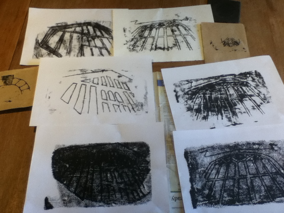
I set up my printing area, using a sheet of acetate as my plate and rolling out a black water based ink onto it. I found it quite hard to get the thickness of the ink correct and so some of my images have appeared to be soaked in ink and don't show a clear image. However, after trial and error, I managed to the get the correct consistency and placed a sheet of paper onto the ink to remove any excess before printing.
I used brown paper and card to create my monoprints and a pencil to draw the design onto the paper. I also used the end of a paint brush to rub onto the paper in order to show the dark areas rather than simply the outline.


