Friday, 6 September 2013

More sewing.

I am really starting to enjoy using the sewing machine now, I find it easy to thread and I have been looking into making different patterns.
I've found some really lovely places to buy fabric from in Chesterfield and Bakewell. The Fabric shop on Chatsworth Road has some really good value material and a wide range of different patterns and designs. 
I bought a small amount of material from a 'bargain box' just to play around with, but i have since used this to make four different objects on the sewing machine. 
I did have a few problems with the thread becoming stuck in the material and therefore jamming the machine and needle, but after sorting this out i managed to quickly start making again. 
Having not had much experience with a sewing machine before, i am pretty impressed with the results of my first few objects and have bought more material so i can hopefully work on some bigger projects and increase my knowledge of using a sewing machine. I think learning this skill is quite important, not to mention enjoyable!


Sunday, 18 August 2013

Sewing!

Recently, I have seen a rise in shops selling fabrics and 'Vintage' styled products like cushions or phone cases. Having been pretty awful at using a sewing machine at school in the past, I had never thought about using one to make my own objects until recently when myself and my mum started buying little squares of fabric in an attempt to make something successfully.  We have two sewing machines at home, however they haven't been used in some years, so we took down both from the loft to see which would be better suited. The older sewing machine which was my grandad and grandmas actually worked better than the newer one. After some difficulty setting up and threading the sewing machine I finally managed to get the hang of it and as it turns out had more success with it than my mum.
I made a couple of small objects while still getting the hang of it, one of which was a scent bag that now hangs on a door in our living room but I also visited a fantastic fabric shop in chesterfield where I bought some scrap fabric for 50p in the hope of doing some more tests with the sewing machine. However, as the material was of a good quality and reasonable size, I thought about what else I could do with it. I had always liked the idea of making myself a case for my nexus tablet and so this is what I set out to do.
I already had the stuffing and the outer fabric but I wanted some for the lining- I found a white new bed sheet at a charity shop for about £2 which means I have plenty of fabric left over to use in later projects.
I layered my fabric, placing the flat stuffing between the two and began sewing from the inside out, once I had fully sewn it up, I snipped the inside corners down so that the outside corners could be pushed out fully and turned it around to the correct way. I was already really impressed with how it had turned out but I wanted to add something to it which would stop my tablet from falling out. I found some lovely ribbon I've had for a few years and a silver button which complimented it well. I hand sewed both of these on and It was done!
I am really impresses with how it has turned out, especially seeing as I haven't really made anything like it before, I will certainly be keeping up using the sewing machine!

Saturday, 17 August 2013

Cards

A couple of years ago my media teacher introduced me to a gallery owner in Bakewell who was interested in a photographic calendar i had made for a project. He liked my photography, however he thought it could have a better potential on greetings cards and so i looked around and it took me awhile to make a decision on printing and choosing my photos. 
I contacted an artist who already exhibited in the gallery with his Photography work; Chris Gilbert at Ravenseye Gallery who I sent a few of my photos to. He gave me some advice on my photographs, helped me to choose the best ones and told me how much It would cost for him to print them. 
I firstly printed only a few to see how they sold at the gallery- I found that I only sold a few, however I managed to sell a lot at a festival I had helped to organise for a project I was currently doing. I then printed more cards but unfortunately this year the gallery I worked at and sold my cards at is no longer up and running. I think its such a shame that it can no longer run, but no one seems to be willing to spend their money on art anymore. 
Therefore, I now have my cards back all packaged up ready to be sold but no one to sell them too! I am currently looking around local galleries that may give my work a space, however it is difficult because there are a lot of different photographic cards around and very little room for more. 
If anyone could help me at all with this then I would be most greatful, especially if I would be able to print more cards and fresh designs. 


Mister Hope and The Green Man Gallery

I first met Mister Hope and saw his work at the Spring Gardens shopping centre in Buxton where he was holding a small exhibition. I was instantly drawn to his quirky illustrations which often use popular and well known characters from books and films. I have more recently seen his work in The Green Man Gallery based in Buxton, which is a large gallery space that allows local artists to exhibit their work, they currently have a few permanent artists but also take on guest artists. I love this gallery because it is so spacious and set out on different floors; not only are you free to wander around, you feel relaxed and able to appreciate the artwork. The Gallery is fairly new and was bought to life by a group of local artists who wanted to bring their artwork to the attention of the local people and subsequently were offered the current premises by Vision Buxton.


Mister Hope is one of the permanent artists at The Green Man Gallery and his work clearly stands out.
Taking inspiration from artists such as Quentin Blake and Tim Burton, Mister Hope has developed a unique style of his own- he often exaggerates a certain area of the character which makes the work so captivating and often humorous. He draws out the images and adds colour using watercolours if necessary, however he has recently started to do paintings using acrylics on canvas which has been as equally successful.
I really like this particular image because even though it looks basic and simplistic there is still an element of detail which he has focused on in the hair and you can without a doubt guess who the character is meant to be.


Mister Hope: http://misterhope.com/
The Green Man Gallery: http://thegreenmangallery.com/

Laura Vann Illustration

Laura Vann is an Illustrator and Graphic designer who after completing a masters degree in Visual Communication (Illustration) at the University of Derby, is a freelance designer specialising in children's picture book illustration. 
I really love Laura's illustrations; they are quirky and individual and i think her use of colour is really effective. 
Below are some of her illustrations found on her website here:


Tuesday, 16 July 2013

Summer Bridging Days- Day 2

Today, we have had two visitors- Anthony Fern and Bew Knox both of which are designers at two different design agencies. Anthony is a previous student from Chesterfield college who studied both art and design and graphics and then left to go to university in (Epsom), he is now based at a large graphic design company around our area which specialises in the leisure industry and so he spends most of his time designing posters, flyers and other promotional material for bars, pubs etc. I think this is both a good thing and bad because although it may give you a good experience of designing for companies, it also doesn't give you a lot of good work for your portfolio which would mean designing outside of work, perhaps freelancing.
Bew seemed more experienced and had worked for longer in the industry than Anthony. I asked him if he thought it was better to be a designer in a big city or somewhere more rural, as coming from quite a rural location, I find the thought of moving into a big city quite daunting. He told me that working in both is great, however, you often find that working in a city at a larger company restricts your creativity in the sense that you are given a brief from a large company and you don't have much freedom to play around with the brand whereas more rural agencies may allow you to spend longer and be more creative with brands and companies. I think I prefer the idea of being able to have that freedom, but also I think it is important that you dont stray too far from the original brief.

Overall, i have really enjoy the past two days and i think they have been helpful as they have given me something to think about over the summer and i can hopefully start developing my portfolio and start thinking about where i'm going to go after my college course is finished. 

Monday, 15 July 2013

Summer Bridging Days- Day 1

Today, i have been thinking about my future and my progression after college, whether i go to university or into a design job.

The Lamp is something i think is very helpful to creative people- it enables you to see what opportunities there are available to you across the whole creative sector, for example if you were focusing on graphic design, there would be nothing to say you couldn't enter a photographic competition. It's about developing yourself as a creative person and increasing your design awareness. The Lamp provides a Facebook page, Twitter account, blog and newsletter, all giving updated information about creative opportunities, competitions, advice and support.

Other webistes i have joined are Behance, Ideas Tap and Linked In which will enable me to develop an online portfolio, look at creative opportunities and create a professional identity. I will hopefully be able to add to my Behance portfolio as i continue on the course into my second year and over the summer.

My Behance Portfolio: http://www.behance.net/hannahjward
Ideas Tap: http://www.ideastap.com/
Creative Choices: http://www.creative-choices.co.uk/
The Lamp: http://supportatthelamp.blogspot.co.uk/
LinkedIn: http://www.linkedin.com/pub/hannah-ward/77/147/193

Wednesday, 26 June 2013

Chesterfield College Fashion Show 2013

Yesterday, we went as a class to view this years fashion show in the heart space which had been built up to form a stage. I've never had a particular interest in fashion but I could easily appreciate the hard work and effort gone into making each garment.
I think all of the pieces shown really represented a good interpretation of the brief name or their own negotiated brief. One of my favourite sections of the fashion show was the 'living dolls' where all the garments had been created using paper, I think they designed some very interesting pieces and worked well with the materials.
The show looked professional In both the sense of the environment that had been made and the models themselves.
The only negative issue I could say about the show was that I left with rather a bad headache due to the music being so loud!

Tuesday, 11 June 2013

Monoprinting

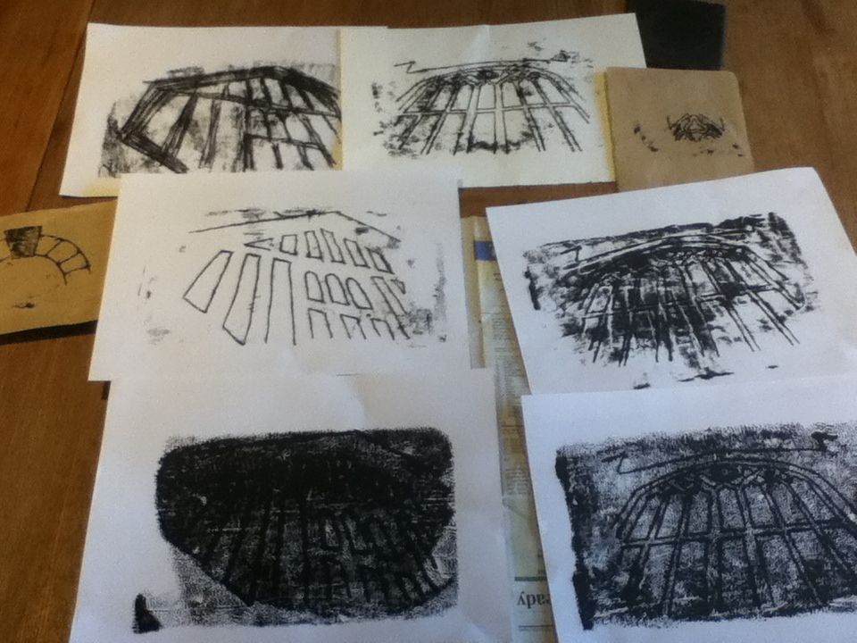
Over the weekend I have done a series of monoprints for my chesterfield projects, mostly based around two photos in particular that I have taken of chesterfield; one of the church windows and the other of a building in the shambles. I chose these two because they have strong, clean lines which would make it easier to use for monoprinting.
I set up my printing area, using a sheet of acetate as my plate and rolling out a black water based ink onto it. I found it quite hard to get the thickness of the ink correct and so some of my images have appeared to be soaked in ink and don't show a clear image. However, after trial and error, I managed to the get the correct consistency and placed a sheet of paper onto the ink to remove any excess before printing.
I used brown paper and card to create my monoprints and a pencil to draw the design onto the paper. I also used the end of a paint brush to rub onto the paper in order to show the dark areas rather than simply the outline.
I am pleased with most of my mono prints, however, some didn't work as well because too much ink was applied which distorted the images slightly. I want to use these monoprints in my project as part of a collage or painted piece. 


Tuesday, 21 May 2013

Sister Corita

Corita Kent, more commonly known as Sister Corita, born in 1918 became known as an artist during the 60s and 70s with her colourful screen printed images.  As her name may suggest, Corita was a nun and her spirit and passion for hope and peace is portrayed through her work. She worked as a teacher of art in The Immaculate Heart College where she was really focused on her students rather than her own work. She was inspired by the media and advertising and she concentrated on type for a lot of her artistic career- she was able to adapt current typography and incorporate it into her work in order to form a completely new meaning or message. She combined materials such as logos from bags, magazine covers and bread wrappers alongside type to redefine the purpose of the object. She would often include poetry, slogans and catchphrases as her type which, combined with other things, I think allowed her to grasp a wider audience because a slogan is often something which is known by many people. By taking a known piece of text, you are able to relate to the audience and manipulate the way in which something is taken- how it is expressed. I love this about Corita’s work because she has been able to give new meanings and life to contemporary sayings or logos.
The process of silk screen printing, or Serigraphs is where ink is applied using a mesh and an ink blocking stencil which will reveal the image. It is quite a simple process, but can look really effective as it does in Corita’s work. I enjoy the bright colours of her art work because I think it expresses her passion for a bright future and is fitting for the time period, she was a pioneer for pop art.
One of her most her famous pieces was a love stamp she designed in 1985 for the US postal service which shows a rainbow of colours, more than 700 million stamps were sold.
Her style of type is very unusual; each character is individual and it looks as though it has a taken a fair amount of time in order to perfect the process.
You can see links with the work I have been doing with polyfusion, however I could take it a step further and incorporate the type from the bags and think about my composition in order to form an effective image.  


Sources
https://www.corita.org/coritadb/index.php?id=5&option=com_content&task=view
http://www.nowness.com/day/2010/6/5/685/breaking-a-habit--sister-corita
http://www.eusa.org/exhibit/SisterCorita
http://www.zachfeuer.com/artists/sister-corita/
http://lisacongdon.com/blog/2013/02/sister-corita-kents-art-department-rules/