Tuesday, 16 July 2013

Summer Bridging Days- Day 2

Today, we have had two visitors- Anthony Fern and Bew Knox both of which are designers at two different design agencies. Anthony is a previous student from Chesterfield college who studied both art and design and graphics and then left to go to university in (Epsom), he is now based at a large graphic design company around our area which specialises in the leisure industry and so he spends most of his time designing posters, flyers and other promotional material for bars, pubs etc. I think this is both a good thing and bad because although it may give you a good experience of designing for companies, it also doesn't give you a lot of good work for your portfolio which would mean designing outside of work, perhaps freelancing.
Bew seemed more experienced and had worked for longer in the industry than Anthony. I asked him if he thought it was better to be a designer in a big city or somewhere more rural, as coming from quite a rural location, I find the thought of moving into a big city quite daunting. He told me that working in both is great, however, you often find that working in a city at a larger company restricts your creativity in the sense that you are given a brief from a large company and you don't have much freedom to play around with the brand whereas more rural agencies may allow you to spend longer and be more creative with brands and companies. I think I prefer the idea of being able to have that freedom, but also I think it is important that you dont stray too far from the original brief.

Overall, i have really enjoy the past two days and i think they have been helpful as they have given me something to think about over the summer and i can hopefully start developing my portfolio and start thinking about where i'm going to go after my college course is finished. 

Monday, 15 July 2013

Summer Bridging Days- Day 1

Today, i have been thinking about my future and my progression after college, whether i go to university or into a design job.

The Lamp is something i think is very helpful to creative people- it enables you to see what opportunities there are available to you across the whole creative sector, for example if you were focusing on graphic design, there would be nothing to say you couldn't enter a photographic competition. It's about developing yourself as a creative person and increasing your design awareness. The Lamp provides a Facebook page, Twitter account, blog and newsletter, all giving updated information about creative opportunities, competitions, advice and support.

Other webistes i have joined are Behance, Ideas Tap and Linked In which will enable me to develop an online portfolio, look at creative opportunities and create a professional identity. I will hopefully be able to add to my Behance portfolio as i continue on the course into my second year and over the summer.

My Behance Portfolio: http://www.behance.net/hannahjward
Ideas Tap: http://www.ideastap.com/
Creative Choices: http://www.creative-choices.co.uk/
The Lamp: http://supportatthelamp.blogspot.co.uk/
LinkedIn: http://www.linkedin.com/pub/hannah-ward/77/147/193

Wednesday, 26 June 2013

Chesterfield College Fashion Show 2013

Yesterday, we went as a class to view this years fashion show in the heart space which had been built up to form a stage. I've never had a particular interest in fashion but I could easily appreciate the hard work and effort gone into making each garment.
I think all of the pieces shown really represented a good interpretation of the brief name or their own negotiated brief. One of my favourite sections of the fashion show was the 'living dolls' where all the garments had been created using paper, I think they designed some very interesting pieces and worked well with the materials.
The show looked professional In both the sense of the environment that had been made and the models themselves.
The only negative issue I could say about the show was that I left with rather a bad headache due to the music being so loud!

Tuesday, 11 June 2013

Monoprinting

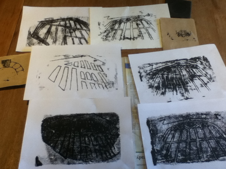
Over the weekend I have done a series of monoprints for my chesterfield projects, mostly based around two photos in particular that I have taken of chesterfield; one of the church windows and the other of a building in the shambles. I chose these two because they have strong, clean lines which would make it easier to use for monoprinting.
I set up my printing area, using a sheet of acetate as my plate and rolling out a black water based ink onto it. I found it quite hard to get the thickness of the ink correct and so some of my images have appeared to be soaked in ink and don't show a clear image. However, after trial and error, I managed to the get the correct consistency and placed a sheet of paper onto the ink to remove any excess before printing.
I used brown paper and card to create my monoprints and a pencil to draw the design onto the paper. I also used the end of a paint brush to rub onto the paper in order to show the dark areas rather than simply the outline.
I am pleased with most of my mono prints, however, some didn't work as well because too much ink was applied which distorted the images slightly. I want to use these monoprints in my project as part of a collage or painted piece. 


Tuesday, 21 May 2013

Sister Corita

Corita Kent, more commonly known as Sister Corita, born in 1918 became known as an artist during the 60s and 70s with her colourful screen printed images.  As her name may suggest, Corita was a nun and her spirit and passion for hope and peace is portrayed through her work. She worked as a teacher of art in The Immaculate Heart College where she was really focused on her students rather than her own work. She was inspired by the media and advertising and she concentrated on type for a lot of her artistic career- she was able to adapt current typography and incorporate it into her work in order to form a completely new meaning or message. She combined materials such as logos from bags, magazine covers and bread wrappers alongside type to redefine the purpose of the object. She would often include poetry, slogans and catchphrases as her type which, combined with other things, I think allowed her to grasp a wider audience because a slogan is often something which is known by many people. By taking a known piece of text, you are able to relate to the audience and manipulate the way in which something is taken- how it is expressed. I love this about Corita’s work because she has been able to give new meanings and life to contemporary sayings or logos.
The process of silk screen printing, or Serigraphs is where ink is applied using a mesh and an ink blocking stencil which will reveal the image. It is quite a simple process, but can look really effective as it does in Corita’s work. I enjoy the bright colours of her art work because I think it expresses her passion for a bright future and is fitting for the time period, she was a pioneer for pop art.
One of her most her famous pieces was a love stamp she designed in 1985 for the US postal service which shows a rainbow of colours, more than 700 million stamps were sold.
Her style of type is very unusual; each character is individual and it looks as though it has a taken a fair amount of time in order to perfect the process.
You can see links with the work I have been doing with polyfusion, however I could take it a step further and incorporate the type from the bags and think about my composition in order to form an effective image.  


Sources
https://www.corita.org/coritadb/index.php?id=5&option=com_content&task=view
http://www.nowness.com/day/2010/6/5/685/breaking-a-habit--sister-corita
http://www.eusa.org/exhibit/SisterCorita
http://www.zachfeuer.com/artists/sister-corita/
http://lisacongdon.com/blog/2013/02/sister-corita-kents-art-department-rules/

Monday, 13 May 2013

Digital drawings.

The following are some digital drawings i have done of Chesterfield.

This was based around a building in chesterfield using a Graphics tablet and brushes in Photoshop, i added an opacity jitter and size jitter to the brush in order to give the shape some irregularity. 


Another graphics tablet drawing i have done of a gravestone in the churchyard again using Photoshop brushes with an opacity and size jitter. 
This final image was drawn using a tablet on an app called SketchbookX which i found really easy to use because it has a few different brushes, it allows you to change the opacity radius of the brush and you can have separate layers. I did struggle slightly without the use of a stylus but i still enjoyed using my tablet to create drawings as it hadn't been something id thought of before.


Friday, 26 April 2013

Sharrow Vale Market

Sharrow Vale Market is an event which happens a few times a year; a large amount of stalls line Sharrow Vale road in Sheffield with a range of different things on offer, such as art and crafts, handmade gifts, antiques, food and music.
I have been a few times before in previous years and I have always enjoyed it. I find it has a very friendly atmosphere and there is plenty to see and buy.
Alongside the market, various shops down the road open their doors and hold special events for the day. One in particular was called The Vintage Tableware Company which was a small building behind a large antiques centre. It didn't look like there was much inside at first until you went through; there were two rooms opposite each other. One contained The Vintage Tableware Company which has beautiful crockery and other 'vintage' tableware.
In the other room, there were two artists displaying their work, one focused upon lino prints and another concentrating on digital designs of buildings and cityscapes.
Jonathan Wilkinson is one of these artists- on his business card it says 'Jonathan Wilkinson is an artist and designer whose prints and products celebrate the buildings and sciences that define where we live'. His artwork is very modern and often portrays urban cityscapes and buildings. Jonathan grew up in Nottingham, however he studied painting and printmaking at Sheffield Hallam University and so therefore a lot of his prints are based around Sheffield.
I love his use of vectors and flat colours to build up an image; they look just as effective as a photograph or painting. Also, I think creating them as vectors portrays their modern and urban feel.
The other artist was James Green who is a printmaker that specialises in the use of lino printing. He likes to user simple graphics in order to compose his art and I really like his style. I find he uses suitable colours for each piece; they compliment each other really well.
There is no particular theme to his work concerning his subject matter, however I have seen that he often uses animals and buildings. One series of prints he did was based around areas of Sheffield- he finds Sheffield a very Inspiring place in the sense that there is a mixture of old and modern architecture, industrial and urban areas.
I feel quite inspired by James's prints; lino printing is something which I share an interest in and I would like to explore it further.

Saturday, 20 April 2013

Storm Thorgerson

Storm Thorgerson, a graphic designer famous for album covers for bands such as Pink Floyd, Led Zeppelin and Muse. Unfortunately, this week Thorgerson passed away after suffering from cancer but his work can still be treasured and I'm sure it will be remembered for many years to come.
One of Thorgerson's most famous pieces of album artwork was for Pink Floyd's The Dark Side of the Moon which features a prism spreading a spectrum of colour across the cover.

Another famous cover he designed for Pink Floyd was one featuring 700 hospital beds which were dragged down to a beach in Devon. Thorgerson liked the photographs rather than illustrations and as this was before the time of Photoshop, it had to become the hard way. The result is a very realistic and believable looking image.

Thorgerson will be missed, however he will still live on in his artwork and continue to inspire.

Storm Thorgerson 1944- 2013

Tuesday, 19 March 2013

Life drawing 12/3/13

This week we have been life drawing again, this time using a male life model. We did two ten minute and two fifteen minute drawings during which I tried to focus on certain aspects of the model’s body. I used charcoal for three drawings and pencil for my last, more detailed drawing of John’s head, neck and chest.
This is my first 10 minute drawing in my sketchbook. I found it hard to get the proportions right on this and the shoulders seem too wide, however i am still happy with this first attempt.

In comparison to the female model, I found John harder to draw because he is quite square shaped; I find it easier to draw curves. On the other hand, I think John has more visible muscles which allow more tone and detail to be added to the drawing. I didn’t find life drawing as easy this week because I was unable to get the shapes and proportions correct.


This is the second ten minute drawing i did on brown paper using charcoal. I was pleased with the results because i managed to get the proportions slightly better than the previous drawing.


On my first fifteen minute drawing i did i concentrated on just the face, however i found this quite hard because i didnt get the proportion of his face to his hand correct and so the hand looks somewhat distorted and out of place.

My final drawing was done in pencil on brown paper over a time of fifteen minutes. I found that i could apply much more detail with the pencil rather than charcoal and therefore i prefer this drawing to my other three.  


Tuesday, 12 March 2013

A Brush With Spring

Over the weekend, i visited A Brush with Spring which is a small exhibition of artwork held by Whitepeaks Fine Art at Peak Village. There was a mixture of different styles of work from figurative to very realistic looking wildlife paintings. Some of the artists which exhibited such as Gina Marsh and Louise Jannetta i had seen before after working part time in a gallery last year, however there were artists such as Keith Maiden (a figurative artist) and Eric Wilson (a wildlife artist) who i had never seen before but found equally as inspiring.


Keith Maiden

Eric Wilson

Colin Halliday