Tuesday, 29 January 2013

Life Drawing continued.

Today we have been doing more life drawing, this time using a male model. We spent 20 minutes on each drawing using different materials such as ink, charcoal and chalk.
The following are images of my drawings.


Monday, 21 January 2013

Jenny Saville.

Jenny Saville, born in 1970, is a modern artist who enjoys working on a large scale, usually basing her works on naked women. After exhibiting in the Saatchi Gallery in London, Saville gained much more publicity for her paintings and has since exhibited worldwide. I like Saville's style; i think she has an interesting approach of representing the human form and her work contains a great amount of depth and texture which makes them much more effective and realistic looking.


Tuesday, 15 January 2013

Life Drawing

Today, i have done some life drawing. The subject for my drawings was hands and feet. Here are some images showing the work i have done.


Thursday, 27 December 2012

Doodle Project (Continued)

The following images show the next few steps of my doodle strip.


Friday, 21 December 2012

Ethical Fashion- Body Image

Body image has been seen to be something as very important in the fashion industry for many years.It has been noted, that models on catwalks and on advertising are unusually thin and therefore this has caused many issues over how someone should look. Unfortunately, as this idealized image has been made about women, it has caused many women to suffer from eating disorders in order to try to conform to society's view on how someone should look. There have been recent efforts to rid of the abnormally thin girls and replacing them with more realistic sized women which better suit today's times. However, i think that there will always be this perception that all women must be the same petite size where the reality is quite the opposite; in our minds that is how we view models and thus the products themselves. Advertisement takes a large part in the portrayal of the industry- again they show stick thin models wearing the clothing which not only makes you want to buy the products because they look good on the models, but it gives you something to aim to.
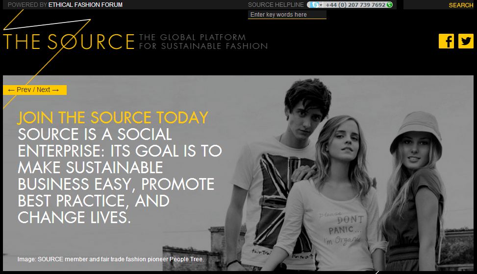
Of course, body image isn't the only issue concerning the fashion industry, there are other things such as; Animal welfare, excessive consumption, cultural appropriation and environmental impact. Collectively, these give a bad name to the fashion industry. Campaigns such as 'The source' aim to help businesses become more sustainable without compromising the people or the environment.


Saturday, 15 December 2012

Doodle Project

After doodling onto A1 sheets of paper, the doodles were cut up into strips. We have used these as a base for a final layered image of doodles. Using tissue paper and PVA glue , i have begun to layer up my image as shown below, covering sections i didn't want to use.


From looking at the doodles i currently have, i would like to adapt them to create a sea theme, using the curves as waves alongside added doodles of my own. 

Monday, 26 November 2012

Printmaking- Lino printing

This week we have been looking into Lino printing. This is the process of using a sheet of linoleum and cutting away areas using a sharp tool to create a relief area on which to print. Our designs were simplified and made angular so that they would be much easier to cut out of the lino. We drew the design onto the lino and began to cut away at the lines; the lines must be cut fairly deep otherwise the image that you are trying to print will not come out as well. Another key thing to remember is that the image you cut out will appear in reverse when printed, therefore, if you were printing then you would need to flip it in order for it to appear in the right way. After removing areas of the lino, we used a roller and ink to charge the lino with ink to print. I took a piece of paper and placed it on top of the lino and proceeded to apply pressure from a large press over the lino. When the paper is removed, what is left should be a perfect print of your design in reverse.

Here is an image of my lino cut which has been adjusted since the first print i did- i removed more of the lino to create different looking images.


I incorporated the research i had done previously into Keith Haring and also the images i had created beforehand using monoprinting to make this image. It is a close up and angular spaceship using the symbol from Haring's greed sign. This was a good choice for a lino cut because the lines could be made straight and cut out easily. I found the process of lino printing quite enjoyable and i think that it is a really good way of getting multiple prints of one design- it is cheap and effective.

Thursday, 22 November 2012

Photoshop and Photmontage- Kurt Schwitters


Kurt Schwitters, born 1887, was known as a master of collages. He used scraps of paper to create interesting pieces which included cuttings from newspapers, posters and advertisements.


I find most of Schwitters work fascinating and he managed to incorporate a message wich was particularly relevant at the time- he was involved with the Dada movement. In this sense, politics begins to play a part in art which heavily influenced the style and format. 
From a design point of view, I think that all the scraps have been carefully placed to create and effective final image and the colours give a certain dark mood.
I think his work is similar to collage rather than photomontage, although, I still think that there are certain aspects from photomontage.  


Photoshop and Photomontage- Raoul Hausmann


Hausmann , born 1886 , was a founding member in the Dada movement and this was very much a part of his artistic style. He used a combination of both paint and images to create his montages and they often reflected his wild personality.


I  think that his work shows a certain precision and skill of composition and juxtaposition which creates an interesting appeal towards his work.
In mixing the images with each other, Hausmann creates a relationship between the objects and in doing so, the image becomes more effective. His use of text and images creates a contrast which is both interesting and eye catching; the change between rough and smooth or the sharpness in each image. 


Photoshop and Photomontage- Robert Rauschenberg


Robert Rauschenberg was another photomontage artist who was inspired by popular culture and loved to experiment.


His materials were unusual , for example, in one piece he used: a tire , a police barrier, the heel of a shoe, a tennis ball and paint to create his artwork. I think this style was interesting because not many people had done the same; it was an experimental expression of a message.
He transferred prints of well known images and used paint to blend the images into one. The images were often linked, although at a first glance you may not notice the detail set on the canvas.
I like Rauschenberg’s style because I think that although it was experimental, a lot of thought has gone into creating and developing techniques to create these pieces. The colours and images work well together and often help to create a certain aspect of the work stand out more prominently than others.