Monday 26 November 2012

Printmaking- Lino printing

This week we have been looking into Lino printing. This is the process of using a sheet of linoleum and cutting away areas using a sharp tool to create a relief area on which to print. Our designs were simplified and made angular so that they would be much easier to cut out of the lino. We drew the design onto the lino and began to cut away at the lines; the lines must be cut fairly deep otherwise the image that you are trying to print will not come out as well. Another key thing to remember is that the image you cut out will appear in reverse when printed, therefore, if you were printing then you would need to flip it in order for it to appear in the right way. After removing areas of the lino, we used a roller and ink to charge the lino with ink to print. I took a piece of paper and placed it on top of the lino and proceeded to apply pressure from a large press over the lino. When the paper is removed, what is left should be a perfect print of your design in reverse.

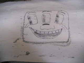
Here is an image of my lino cut which has been adjusted since the first print i did- i removed more of the lino to create different looking images.


I incorporated the research i had done previously into Keith Haring and also the images i had created beforehand using monoprinting to make this image. It is a close up and angular spaceship using the symbol from Haring's greed sign. This was a good choice for a lino cut because the lines could be made straight and cut out easily. I found the process of lino printing quite enjoyable and i think that it is a really good way of getting multiple prints of one design- it is cheap and effective.

Thursday 22 November 2012

Photoshop and Photmontage- Kurt Schwitters


Kurt Schwitters, born 1887, was known as a master of collages. He used scraps of paper to create interesting pieces which included cuttings from newspapers, posters and advertisements.


I find most of Schwitters work fascinating and he managed to incorporate a message wich was particularly relevant at the time- he was involved with the Dada movement. In this sense, politics begins to play a part in art which heavily influenced the style and format. 
From a design point of view, I think that all the scraps have been carefully placed to create and effective final image and the colours give a certain dark mood.
I think his work is similar to collage rather than photomontage, although, I still think that there are certain aspects from photomontage.  


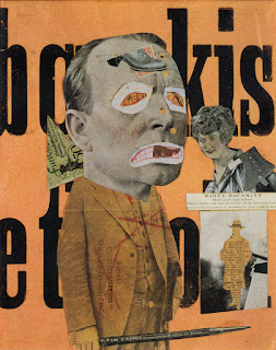
Photoshop and Photomontage- Raoul Hausmann


Hausmann , born 1886 , was a founding member in the Dada movement and this was very much a part of his artistic style. He used a combination of both paint and images to create his montages and they often reflected his wild personality.


I  think that his work shows a certain precision and skill of composition and juxtaposition which creates an interesting appeal towards his work.
In mixing the images with each other, Hausmann creates a relationship between the objects and in doing so, the image becomes more effective. His use of text and images creates a contrast which is both interesting and eye catching; the change between rough and smooth or the sharpness in each image. 


Photoshop and Photomontage- Robert Rauschenberg


Robert Rauschenberg was another photomontage artist who was inspired by popular culture and loved to experiment.


His materials were unusual , for example, in one piece he used: a tire , a police barrier, the heel of a shoe, a tennis ball and paint to create his artwork. I think this style was interesting because not many people had done the same; it was an experimental expression of a message.
He transferred prints of well known images and used paint to blend the images into one. The images were often linked, although at a first glance you may not notice the detail set on the canvas.
I like Rauschenberg’s style because I think that although it was experimental, a lot of thought has gone into creating and developing techniques to create these pieces. The colours and images work well together and often help to create a certain aspect of the work stand out more prominently than others.


Photoshop and Photomontage- Peter Blake

Peter Blake, best known for his individual pop art style and album covers, is a british artist taking a lot of influence from pop music and it's audience. He became quite central in the 60's in the pop art movement and has produced art in ranges of media such as collage, sculpture, engraving, printmaking and particularly album artwork. 

One of his most famous pieces of work is the Beatles cover 'St. Peppers Lonely Hearts Club Band' which incorporates a range of different images of people who had significance in the lives of the Beatles; people who they admired. 


I think that the design for this album cover is clever and reflects the nature of the music. The bright colours make it stand out and this is particularly effective at drawing people in. This was very influential in developing the pop art movement with the Beatles fast becoming one of the most popular bands of their time. 


The above image is another of piece of art by Blake, which shows iconic and recognisable images such as the Coca Cola logo or Elvis. The use of these images allows the audience to relate to them and once again the pop art style makes it slightly bizarre but the use of the images looks correct. The abnormality of the image is contained within the border and each block is the same size which allows a certain sense of regularity to it. 

Wednesday 14 November 2012

Photomontage and Photoshop- Thomas Barbey

Thomas Barbey

 Thomas Barbey, born 1957, only started creating his unique photographs in 1994 after leaving a career in music. 
His work is very interesting because instead of taking numerous photos and merging them using editing software such as Photoshop, Barbey uses a method of putting together two or more negatives together. Exposure is key in his photographs, this is pre-programmed by Barbey so that his images can be layered and printed simultaneously. It is hard to understand the process of his work, however i do not think it is always necessary to fully understand the technique to be able to appreciate the image. 
I like his work a lot because it has a lot of thought behind it and the final effect is striking and really interesting to look at. Barbey takes his inspiration from artists such as Rene Magritte and M.C Escher and it is easy to see their surreal influences in his work.


Photomontage and Photoshop

Dave Mckean


Dave Mckean is a British artist who works within different types of media and has previously done work for book covers, CD covers, posters, children's books, postcards, films and magazines.
 

His work is a mixture of photographs, illustrations and found objects, this is a very attractive combination and you can see how he has used these features to create striking images.
I like Mckean’s work because of his interesting and unique approach to the style. I think his dark colour choices are effective and they often reflect the nature of the book, film, band or even children’s book; he seems to favour this dark style throughout his work.

Monday 12 November 2012

Andy Warhol


Andy Warhol is best known for his importance in the world of pop art where he began by experimenting with paintings of Campbell’s soup tins and coca cola bottles. Before this he worked as a commercial artist for magazines and also designed advertisements.
Warhol applied monoprint to many of his earlier pieces of art; these were mainly for his commercial works which made him very successful as an illustrator. Around 1960 Warhol decided to change his style and began to use paint and a canvas rather than monoprints and blotted line drawings. After creating a series of paintings and selling them he realised that he wouldn’t be able to create the images fast enough and so decided to try out silk screen printing which would allow him to use a stencil to recreate many versions of images.
I find Andy Warhol’s style very interesting and although the images may seem simple, there is actually quite a lot of depth to them. This simplistic style is what makes it pop art, but Warhol still manages to incorporate detail into his pieces which makes them more interesting and clever.


Tracey Emin


Emin is an artist who finds inspiration from her own life and what she sees around her. The type of work she does ranges from painting, drawing, video, photography, monoprint, needlework and sculpture. Her work is very personal and she has been able to channel her emotions and thoughts into creations.
She has created a series of monoprints, which often portray and represent events that happened in her past. These frequently include text as well as the image itself, however sometimes it is just the image or text alone. Emin’s style in her monoprints is very sketchy and casual as if they are sudden thoughts or notes that she wanted to write down, this applies especially to her use of text.
I think that although the style of her monoprints is very informal, they seem to have quite a bit of thought put into them- even if the drawing took a short amount of time to do, it still shows the feelings behind it. Personally, I am not an admirer of her work and therefore do not take much inspiration from her pieces, however I do think the technique for her monoprints is helpful to look at.


Tuesday 6 November 2012

Printmaking photos

These are some of the photos i took while doing mono printing. 

This was an image i drew by Keith Haring called The Radiant Baby on the back of brown paper.

On the other side of the brown paper i used coloured tissue paper in a block with a border to create a background and fit in with the artist's style.
 I then placed the paper with the image facing upwards onto the ink and traced over the lines of the drawing. 
This is what the final print looks like. The only disadvantage that i had when i drew on my image was that it would be backwards when i printed, a way around this would be to find an image on the internet, flip it and print using that image instead.


These are another few images of the prints i have done based on Keith Haring's work.


Printmaking

Printmaking has been used over the years to create rather interesting and often abstract images. Today we were introduced to print and our objectives were to complete a series of A4 monoprint, use monochromatic and least two other colours and use other materials to create a different effect on the final image.

The process of monoprinting is fairly simple; to print an image onto the paper you first need to either have a picture you want to print or draw an image onto one side of the paper. You would then need to place the paper, image up, onto a surface coated in the ink you have chosen to use. It is important not to touch the paper when it is on the ink because any sections that you do touch will show the black ink through and this will ruin the image. You then need to draw over the linesof the image you have which will pick up the ink on the other side. The more pressure you put onto the pen or object you are using to go over the line, the darker the ink will appear. We used different objects- biro pens, pencils, graphite sticks and even just fingers to apply pressure.

We used primary colours in our printwork and i think this aids the design of the image especially as the artist work i have used by Keith Haring is very similar in both colours and style. Instead of using the colour from the ink i did one print with a background coloured from tissue paper and brown paper and then applied a black ink outline of an image on top. I thought about the style of the background so that it would fit in with the artist's work; i used an orange square of tissue paper and a dark border which is often a favorite style of Harings.

Overall, i enjoyed printmaking and the effect it has on images because i think it is more appealing to the eye and it encourages depth into the image. I found the process easy to do and i experimented with a use of different materials which made it even more interesting. Some prints worked better than others, but the ones that did came out really well and i also attempted to mix colours such as red and yellow to create an orange. This effect was interesting but also effective because it allowed you to just use primary colours to create new colours.