Wednesday 24 October 2012

Claire Rollet

Claire Rollet is a freelance illustrator who is particularly inspired by her surroundings of London. Her illustrations are created using pen and ink and then coloured digitally. A careful use of colour in her work, picks out the key details and makes a clean representation of the architecture. I think that the amount of detail used in her images is balanced with her use of few colours; the images don't look too cluttered and the composition is good.


Saturday 20 October 2012

Olivier Kugler


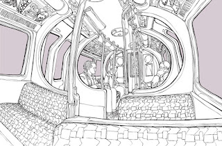
Olivier Kugler  is an illustrator who creates detailed and intricate images.
I find the use of the rough lines interesting as it creates a flowing effect, it makes the image look much more natural whereas straight lines would make it look more clinical.
The colours Kugler uses are fairly neutral and used effectively to create an image with impact.

He often uses text in his illustrations and in this sense i think that these look similar to comic strips or sections from newspapers.
I really like the style of his work; though some parts may look incomplete, it makes it interesting to look at and is eye catching.

http://www.olivierkugler.com/

Friday 19 October 2012

Tommy Penton

Best known for his CD cover artwork, Tommy Penton is an illustrator who creates quirky an detailed images. Some of his artwork is done in basic colours such as the image above; a very intricate illustration of a train journey. On the other hand, some of his work is very abstract and colourful, often putting objects in unfamiliar areas, such as the image below.


I like some of Penton's work; mostly his more detailed black and white pieces which i think have more of an impact.

http://www.tommypenton.com/

Chris Dent

Chris Dent is another illustrator who usually hand draws his images. There is a lot of detail in every image and it causes the viewer to concentrate and look carefully at each image- every detail is important in the whole image.

I particularly like this image of his called 'Puma'. The use of architecture in this piece is clever because each building is specifically shaped to create the outline of the Puma.
Often, Dent uses only a small amount of colour in his work which allows the detail to stand out more and overall makes the image more effective.

http://www.chrisdent.co.uk/

Andy Council


Andy Council is an illustrator from Bristol who particularly enjoys creating incorporating architecture and dinosaurs into his work. The image above is a map of Britain with a difference- Council has taken key landmarks from around the country to build up the landscape. For example, in London, you can clearly recognise the London Eye and Big Ben or in Scotland you can see the Loch Ness Monster. Although the landmarks are small, they are very detailed and this really gives the image impact.


This is another clever design by Council because the dinosaur fits perfectly with the skyline even if it is rather abstract. I think that this piece works really well because of how much detail and precision is shown in the image, if it didn't have this i don't think it would've been quite so effective. 


Thursday 11 October 2012

Featured blogger- Afternoon Pity Party

The Afternoon Pity Party is a blog which shows the work of Elisabeth McNair, an illustrator and designer. The blog also includes other things which interest her, such as other illustrators, painters and photographers. I think that this blog is very interesting to read and look at; it contains a range of different posts with a mixture of both her own work and others.

http://www.afternoonpityparty.com/

Wednesday 3 October 2012

Featured blogger- little doodles


Little Doodles are the creations of London based illustrator Kate Wilson. Her designs are clever and beautifully drawn; her style is very recognisable and has a wide range of different characters and icons. 
This is my favourite blog that i am currently following because i think she has quirky designs and interesting style.